Services
|
GraficMatter is a Brand Management company that offers services to help businesses dive deeper into their visual communication. Our program is divided into smaller brand pieces to help you plan and take control of your company brand. With a clean and concise brand voice online and an outbound on the main street, we help clients to create a strong brand message. A consistent brand message is a crucial part of your digitized path forward while growing your business.
|
Categories
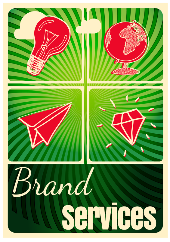
Our Brand Services are broken-up into 4 brand parts: Development, Promotion, Digitized, and Corner. Together they help to give our clients a full portfolio of artwork to market and promote their business.
Before Your Launch
Entrepreneurs ready to launch the next great business idea should start with their logo and business concept. This should then be followed by branded corporate material, a website and a business sign.
Build Your Brand
Your brand tends to grow with your business as you evolve and structure your operation. Expanding your brand and setting your main art with logo options and matching icons is the natural progression of building a brand. Recycling elements to easily brand your social media and vehicle is plain genius!
Establish on Your Brand
Businesses who are getting comfortable and would like to build a more regular clientele should start looking into multi channel marketing. For engaging designs with a wow factor, you need secondary art with beautiful images, backgrounds and textures. These are used to create engaging promotional art, email templates and pin-worthy product images.
Brand Consistency
Your clients love you, you have established community partners and are being called upon to deliver presentations as an expert in your field. Make sure your brand is treated with care with a detailed brand style guide. Have professional leave behinds at your branded presentations to leave a lasting impression. Stand out from your competitors with an annual report that shows just how amazing you are.
Explaining the "why"
Your logo is the visual cornerstone of your company to create brand recognition.
Branding your social media creates brand awareness in a digital world.
A striking branded business portfolio creates brand loyalty.
Branded promotional items that are handy create brand perception, making you the brand hero!
Guerrilla Marketing is cost effective. There is no better way to get people to talk about you on social media.
A branded website pulls your existing in person persona through to a digital representation of your business online, magnifying your brand.
Process (Services)
1. Line is created when making marks with a pencil, pen or brush. These forms the outlines or suggest a shape.
2. Shape is the organic form that contains the geometric shape of something that also creates negative space around it.
3. Direction is the combination of lines, vertical, horizontal or oblique and the feeling and movement it suggests.
4. Size implies to the relationship between objects and the area occupied.
5. Texture is something you can see or feel in the surface of an object. It can enhance the quality of a share whether it is smooth, shiny, rough, etc.
6. The quality of your color is also referred to as the hue whether you are using an RGB or CMYK palette using contrasting colors or harmonious colours.
7. Value is the tone of your color palette whether used with light tone as tints or darker tones as shadows.
8. Balance is achieved by placing shapes of different tones next to each other.
9. Gradation refers to the direction indicated with the use of shapes in relation to the use of color or gradient. This helps to indicate movement while directing one’s eye.
10. Repetition in can be boring but when you add variety with a degree of variation it becomes something of interest.
11. Contrast is the use of opposite parts to create interest. The use of opposite colors, contrasting tones, direction, quality of line all creates a sense of chaos and unease making something interesting.
12. Harmony is achieved when you use similar visual parts such as shapes, color and lines that goes together.
13. Dominance is used to emphasize something. This counteracts chaos or something boring giving it interest.
14. Unity is when you are able to use dominance, direction, texture, lines, texture, tones and other elements of design together to create a design that is visually appealing.
Brand Evaluation
Clients wants a logo, business cards, website or social marketing.
Brand Brief Checklist Questions:
Brand Brief Checklist Questions:
- What colors do you like?
- Design Masculine / Feminine
- Slogans
- Hierarchy what is important
Market
If your market is the savvy trendsetters and leaders liking funky stuff then we are the company to manage your brand.
We can help you sneak up on them inbound while using their digital devices or outbound while using the loo with traditional marketing tools. This crowd is hard to impress as they have seen it all so having a clever and bold brand manager is crucial to your success!
Our lighthearted and fun approach to identifying your market will make them love your brand and what you have to offer. Positive reinforcing your brand with feeling good campaigns that makes people smile is what branding is about. When you have a strong message wrapped in fun it is easy to appeal to all kinds of people.
Your brand will be valued, shared and talked about when you give them something to talk about! We specialize in unexpected, clever Concept Development and target marketing.
Why you need an established designer?
Colors, layout, mission...they all determine your unique niche and how your business is perceived.
Anyone can throw in an image and call it a logo. Branded design is not the result of luck but careful and precise execution of visual communication, telling the story of your company.
Elements of design are the parts that work together to create any visual artwork. There are seven elements of design that graphic artists are trained in, to create something that is visually appealing.
Jog words and Elements of Design explained
1. Line is created when making marks with a pencil, pen or brush. These forms the outlines or suggest a shape.
2. Shape is the organic form that contains the geometric shape of something that also creates negative space around it.
3. Direction is the combination of lines, vertical, horizontal or oblique and the feeling and movement it suggests.
4. Size implies to the relationship between objects and the area occupied.
5. Texture is something you can see or feel in the surface of an object. It can enhance the quality of a share whether it is smooth, shiny, rough, etc.
6. The quality of your color is also referred to as the hue whether you are using an RGB or CMYK palette using contrasting colors or harmonious colours.
7. Value is the tone of your color palette whether used with light tone as tints or darker tones as shadows.
8. Balance is achieved by placing shapes of different tones next to each other.
9. Gradation refers to the direction indicated with the use of shapes in relation to the use of color or gradient. This helps to indicate movement while directing one’s eye.
10. Repetition in can be boring but when you add variety with a degree of variation it becomes something of interest.
11. Contrast is the use of opposite parts to create interest. The use of opposite colors, contrasting tones, direction, quality of line all creates a sense of chaos and unease making something interesting.
12. Harmony is achieved when you use similar visual parts such as shapes, color and lines that goes together.
13. Dominance is used to emphasize something. This counteracts chaos or something boring giving it interest.
14. Unity is when you are able to use dominance, direction, texture, lines, texture, tones and other elements of design together to create a design that is visually appealing.
2. Shape is the organic form that contains the geometric shape of something that also creates negative space around it.
3. Direction is the combination of lines, vertical, horizontal or oblique and the feeling and movement it suggests.
4. Size implies to the relationship between objects and the area occupied.
5. Texture is something you can see or feel in the surface of an object. It can enhance the quality of a share whether it is smooth, shiny, rough, etc.
6. The quality of your color is also referred to as the hue whether you are using an RGB or CMYK palette using contrasting colors or harmonious colours.
7. Value is the tone of your color palette whether used with light tone as tints or darker tones as shadows.
8. Balance is achieved by placing shapes of different tones next to each other.
9. Gradation refers to the direction indicated with the use of shapes in relation to the use of color or gradient. This helps to indicate movement while directing one’s eye.
10. Repetition in can be boring but when you add variety with a degree of variation it becomes something of interest.
11. Contrast is the use of opposite parts to create interest. The use of opposite colors, contrasting tones, direction, quality of line all creates a sense of chaos and unease making something interesting.
12. Harmony is achieved when you use similar visual parts such as shapes, color and lines that goes together.
13. Dominance is used to emphasize something. This counteracts chaos or something boring giving it interest.
14. Unity is when you are able to use dominance, direction, texture, lines, texture, tones and other elements of design together to create a design that is visually appealing.
What We can create for you?
Depending if you’re starting and have absolutely no artwork, if you have a little but hate it, or if you have a little and love it, we are here to help you all the way. No job is too small or to big for us. We create logos, brand manuals, websites, social media - anything and everything your company and heart could desire.
HOW CAN WE HELP?
Drop us your details and we'll get back to you.
SOCIAL MEDIA |
BRANCHESWest Suffield, CT, USA
(860) 214 9900 (Melien Lavoie) Glenwood Durban, KZN, South Africa (072) 773 2332 (Corlia van Tonder) |


